ART Lesson #1
A study of Color
A study of Color
Our latest art project was a study of color.

I started by introducing the students to the work of Georgia O’Keeffe.


Next, we began a discussion about the color wheel and the presence of complementary (opposite) colors on the wheel.

We talked about the contrast between complementary colors and how they create “visual interest” when placed next to each other. Similarly, warm and cool colors have high contrast when placed next to each other, which was going to be the focus of this art project.


STEP 1
Practice our blending technique.
I had the students practice the use of complementary colors to create shadows.

We used green to create shadows on red, and orange to create shadows on blue.
STEP 2
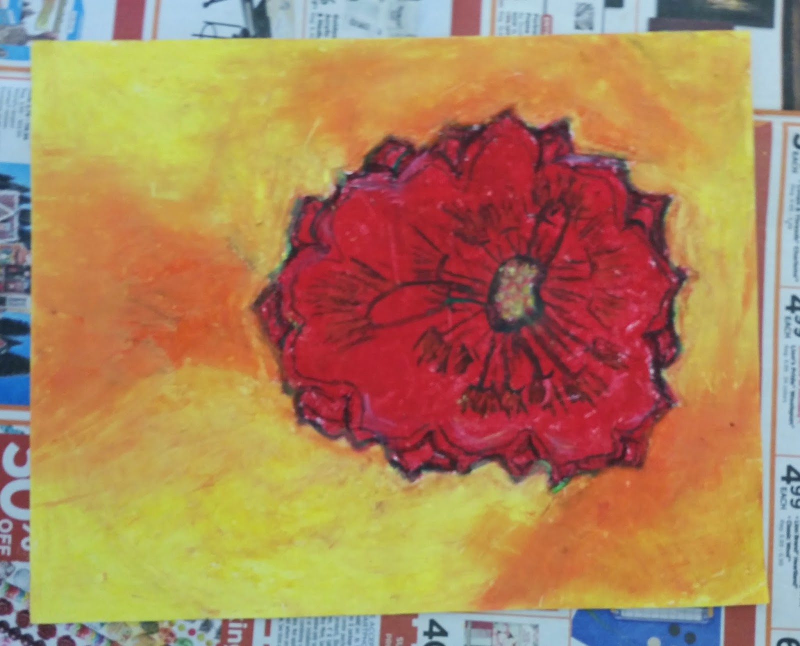
Create a flower using warm colors.
Using the Georgia O'Keeffe image on the left, I guided the students through the creation of the image on the right.

Using oil pastels, we focused on layering and blending to achieve rich colors. We also practiced a popular color technique—that of mixing two complementary colors to create shadows. In our first flower, we started with red and layered in green to create the appearance of shadows. If you look closely, you may be able to see hints of green in the shadows of the red flower. These complementary colors, when mixed together create a dark gray appearance. The shadows helped create dimension in our flowers. Here are some of the results of our warm-colored flowers.


STEP 3
Create a flower using cool colors.
Again, using oil pastels, I guided the students through the creation of their second flower.

Using the Georgia O'Keeffe image on the left, I led them through the creation of the image on the right.
The focus was again on layering and blending the pastels to achieve a rich color. Once we were finished with the basic image, we again practiced layering complementary colors to create the shadows on the flower. This time the shadows resulted from layering orange on top of blue.


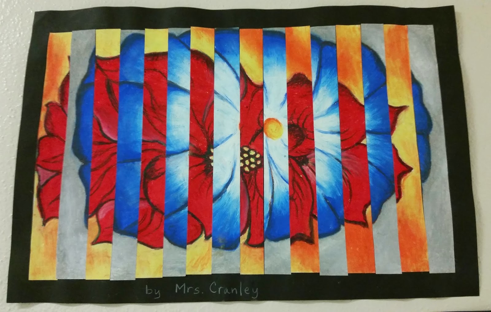

The two examples above, show two different ways of cutting and interchanging the pictures. The students got to choose which orientation they wanted. One option created a long narrow image while the other offered a wider shorter version.
Check out the beautiful works created by our class!


STEP 4
The surprise ending—students were not informed of what our final step would be. On Friday I introduced them to the process of cutting up the two images and merging them into one.
The two images were then glued together on a black background, interchanging the two color schemes, creating a dramatic visual effect.


The students reactions were mixed--some were alarmed, shocked, excited and concerned. Regardless of their initial reaction to this final step, I think all were pleased with the end result.


I talked about the contrast between complementary colors and how they create “visual interest” when placed next to each other. Similarly, warm and cool colors have high contrast when placed next to each other, which was going to be the focus of this art project.
We used the subject matter of Georgia O’Keeffe as inspiration for the project, as she has many wonderful images of flowers in both warm and cool color schemes.

STEP 1
Create a flower using warm colors.
Using the Georgia O'Keeffe image on the left, I guided the students through the creation of the image on the right.
Using oil pastels, we focused on layering and blending to achieve rich colors. We also practiced a popular color technique—that of mixing two complementary colors to create shadows. In our first flower, we started with red and layered in green to create the appearance of shadows. If you look closely, you may be able to see hints of green in the shadows of the red flower. These complementary colors, when mixed together create a dark gray appearance. The shadows helped create dimension in our flowers. Here are the results of our warm-colored flowers.


STEP 2
Create a flower using cool colors.
Again, using oil pastels, I guided the students through the creation of their second flower.
Using the Georgia O'Keeffe image on the left, I led them through the creation of the image on the right.
The focus was again on layering and blending the pastels to achieve a rich color. Once we were finished with the basic image, we again practiced layering complementary colors to create the shadows on the flower. This time the shadows resulted from layering orange on top of blue. If you look closely you can see hints of orange in the shadows on the blue flower.
.jpg)
.jpg)
STEP 3
The surprise ending—students were not informed of what our final step would be. On Friday I introduced them to the process of cutting up the two images and merging them into one.

The two images were then glued together on a black background, interchanging the two color schemes, creating a dramatic visual effect.
The students reactions were mixed--some were alarmed, shocked, excited and concerned. Regardless of their initial reaction to this final step, I think all were pleased with the end result.


ART Lesson #2
Winter Birds on a Wire


The first step was to make a mosaic tile background from paint swatches. The background was going to represent a winter Portland Sky so we used muted blues and grays to create our sky.


Once our backgrounds were complete, we began to work on our birds and our wire.

We used black vinyl contact paper to create a silhouette of a bird and a telephone wire.

In order to make this part of the project student friendly and ensure success for all, I created a template of basic shapes and sizes that the students could put together to make their birds.

Each student had to trace the shapes they wanted to use onto the contact paper and then cut them out in order to place them onto their background.


Within this format, there was still opportunity for individual expression while at the same time maintaining an aesthetic the whole class shared.


The final step was to apply white puffy paint to our pictures to make it look like the birds have been sitting on the wire, all the while, collecting snow atop their heads.


The pictures turned out wonderful! They stand alone, but the real magic comes to life when they are all displayed together.

The collective works create an image of many telephone lines hanging together with a plethora of birds.
ART Lesson #3
Artist Bookmark Series
With the recent purchase of many new classroom novels, comes the need for bookmarks. Many of the students have 2 or 3 books at their desk and they need readily available bookmarks. This need, and our love of art, has inspired the Artist Bookmark Series. During the coming weeks, and perhaps months, the students and I will be exploring popular artists and their signature works as we try to emulate their artistic style in miniature format on a one-of-a-kind-bookmark! We have already created our first productions which paid tribute to the famous artists Wassily Kandinsky, Jackson Pollock, and M.C. Escher. Please ask your child to show you their bookmarks. They are allowed to bring them home as soon as they are complete and laminated. Our first three collections turned out fantastic! I look forward to many more brilliant samples in the future! I have included a couple of photos of the first collections and stay tuned for more to come!

Original Kandinsky Painting

Kandinsky inspired Bookmarks

Original Jackson Pollock Painting

Jackson Pollock inspired Bookmarks

Original M.C. Escher Drawing

M.C. Escher inspired Bookmarks

Original Mondrian Painting

Mondrian inspired Bookmarks

Original Georgia O'Keeffe Painting

Georgia O'Keeffe inspired Bookmarks

Original Salvador Dali Painting

Salvador Dali inspired Bookmarks

ART Lesson #4
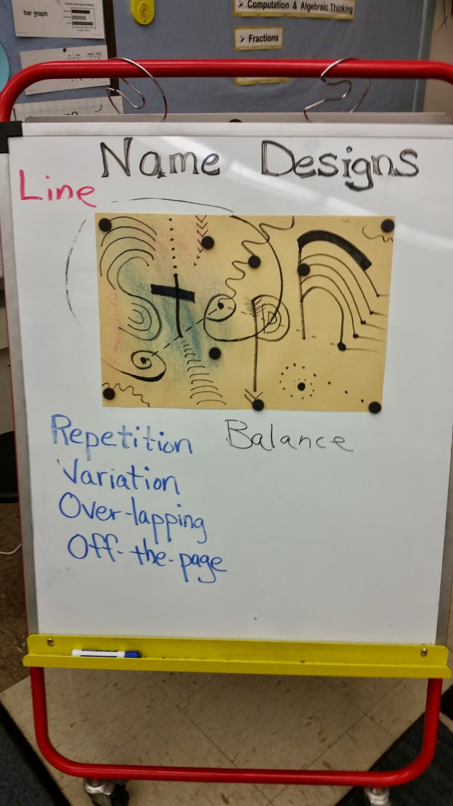
Name Designs
The students were introduced to the basic design principles of repetition, variation, overlapping and off-the-page. They were asked to use each technique in their drawing in order to create "visual interest". I modeled the use of these simple ideas as I used line to create a drawing and design centered around the letters in my name.
The students enjoyed learning the design principles and seemed excited to do their own. We will be finishing them up this week and I will post pictures when we are finished.
.jpg)
ART
Friday's art lesson centered around some techniques artists use to create visual interest in a work of art. I introduced students to a few more design principles, which I asked them to employ in their design.

I completed the example above with the students, as we discussed and demonstrated each of the 4 techniques. The students seemed very interested in these simple techniques, that when used together, begin to create a visually interesting design. I also introduced the idea of an art element. Today we were using the art element of line. This week we will add the art element of color to our design.
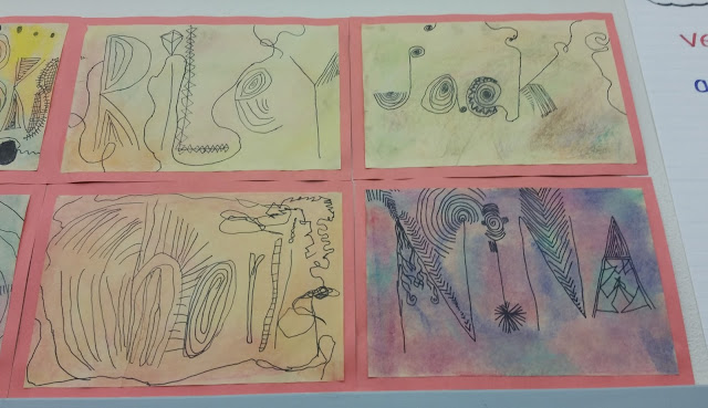
The students then began practicing these design principles as they created a design of their own centered around the letters of their name.


Once they had their designs completed in pencil, they could then outline the lines with sharpie.


The students did a fantastic job! The final step will be to add color in the form of chalk.

I will post pics of the finished art work next week.


ART

On Friday we finished up our name designs by adding colored chalk to our backgrounds and then spraying them with a hairspray fixative. They are currently being pressed, and will be matted and hung this week. I will post more pics of the full collection of our art next week.


NAME DESIGNS


ART Lesson #5
Animal Silhouettes


Students took turns choosing a silhouette of a native Oregon animal or tree, which they traced onto black paper. Thank you parents who helped cut out our subjects. We then used this image as the center of our art piece.


After introducing the concept of color gradation to the students, they were asked to choose a color for their project.


All students began with white paint, and then I added drops of their chosen color to slowly tint the paint to create a gradation of their color. The students sat in groups based on their choice of color, which made the process easy to manage.


They did a great job!


After introducing the above art vocabulary, and explaining the directions for the project, the students chose the color they wanted to use, and were then seated in groups according to their color choices.


ART Lesson #6
Fall Tree Silhouettes

Students were once again asked to practice the design principles of off-the-page, variation, and over-lapping. By paying attention to these visual techniques, they could achieve more visual interest in their tree branch designs. This is easier said then done.


In addition to practicing these design techniques, we also added fall leaves to our tree branches - some hanging, some falling, and others collecting on the ground.


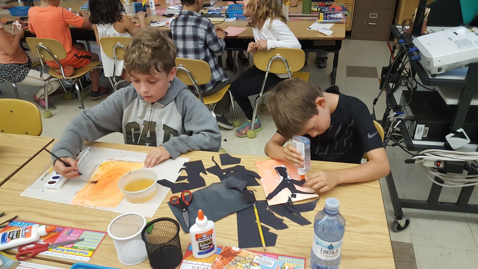
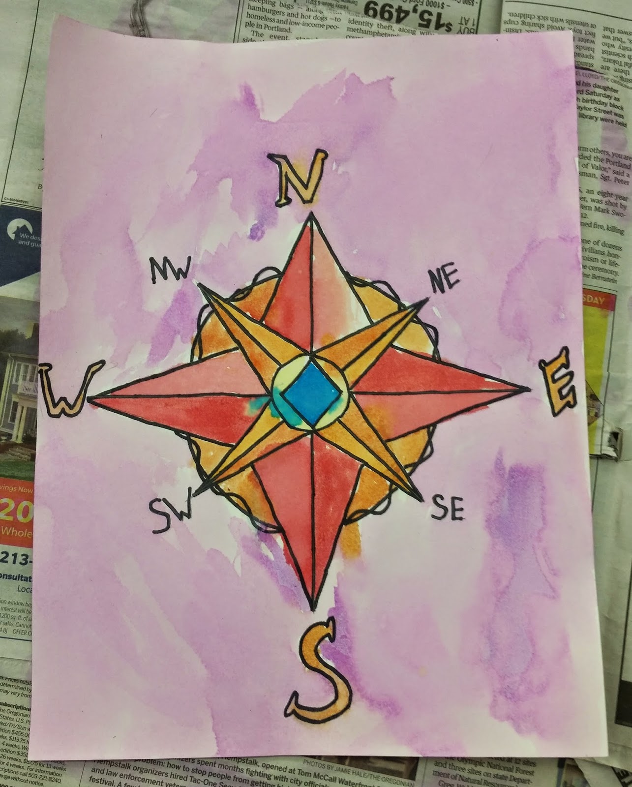
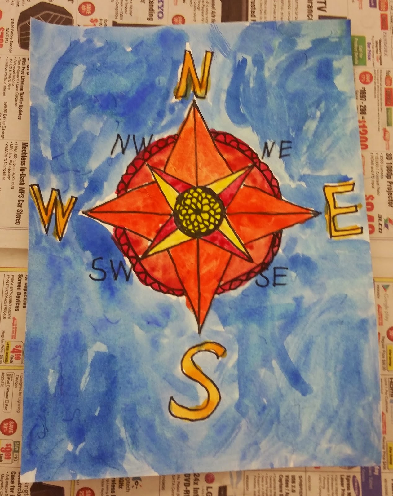
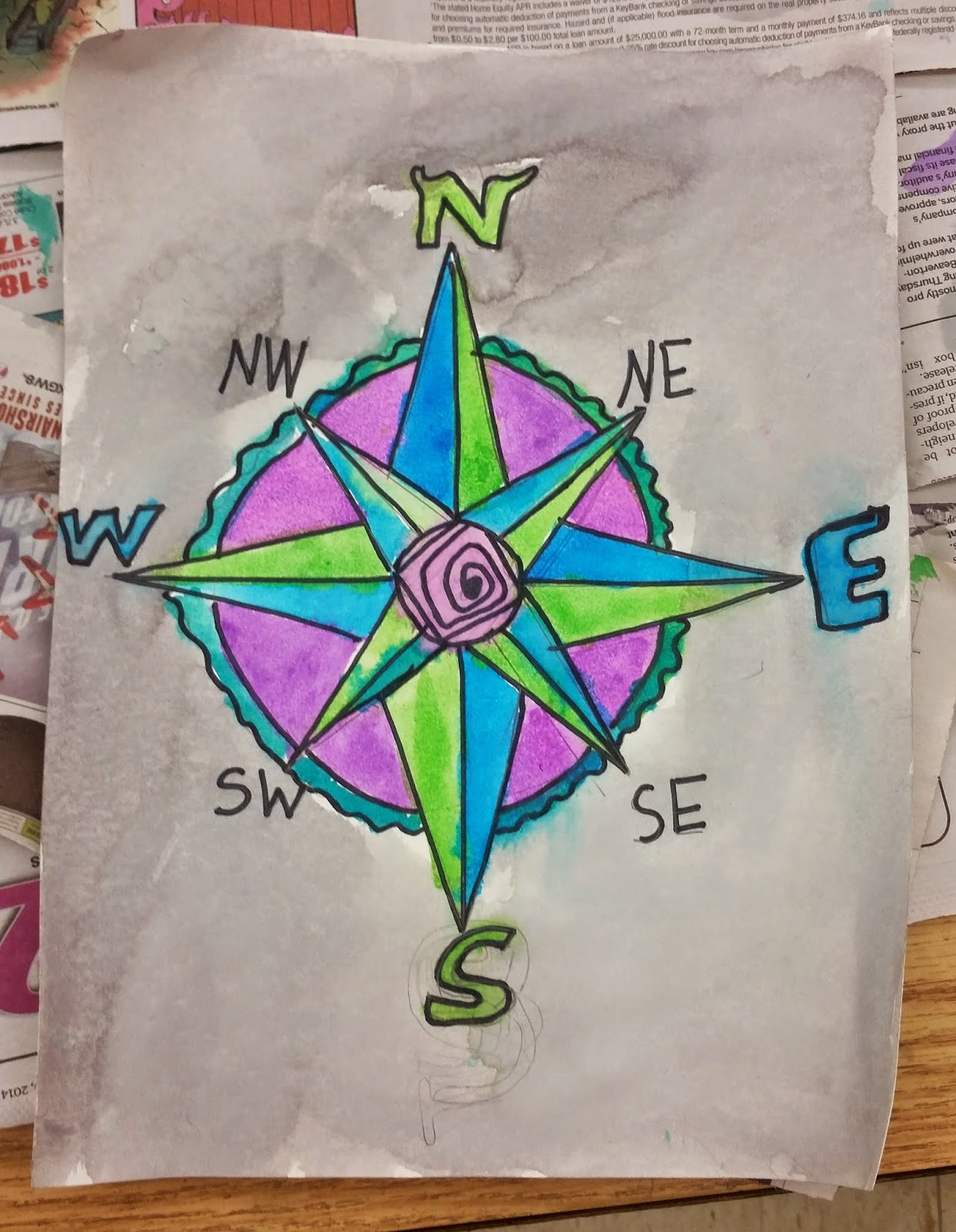
ART Lesson #7
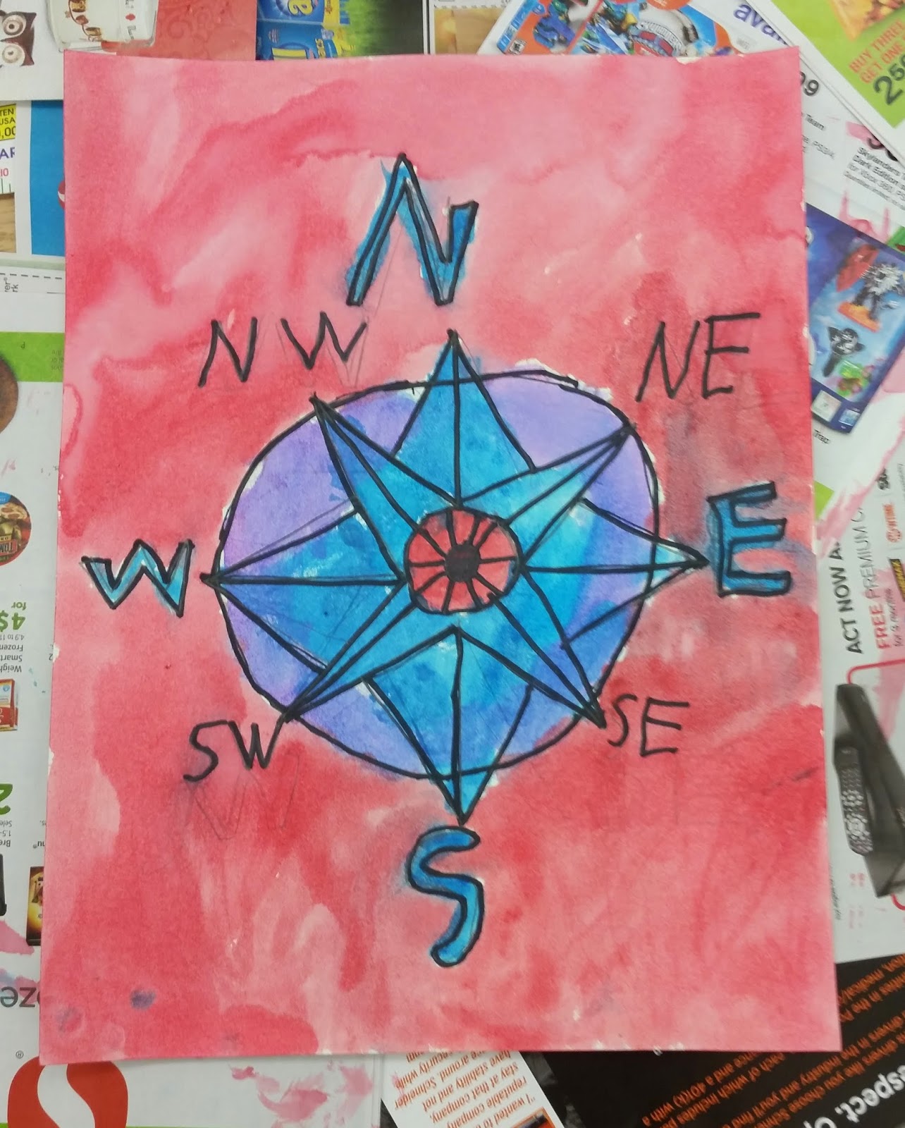
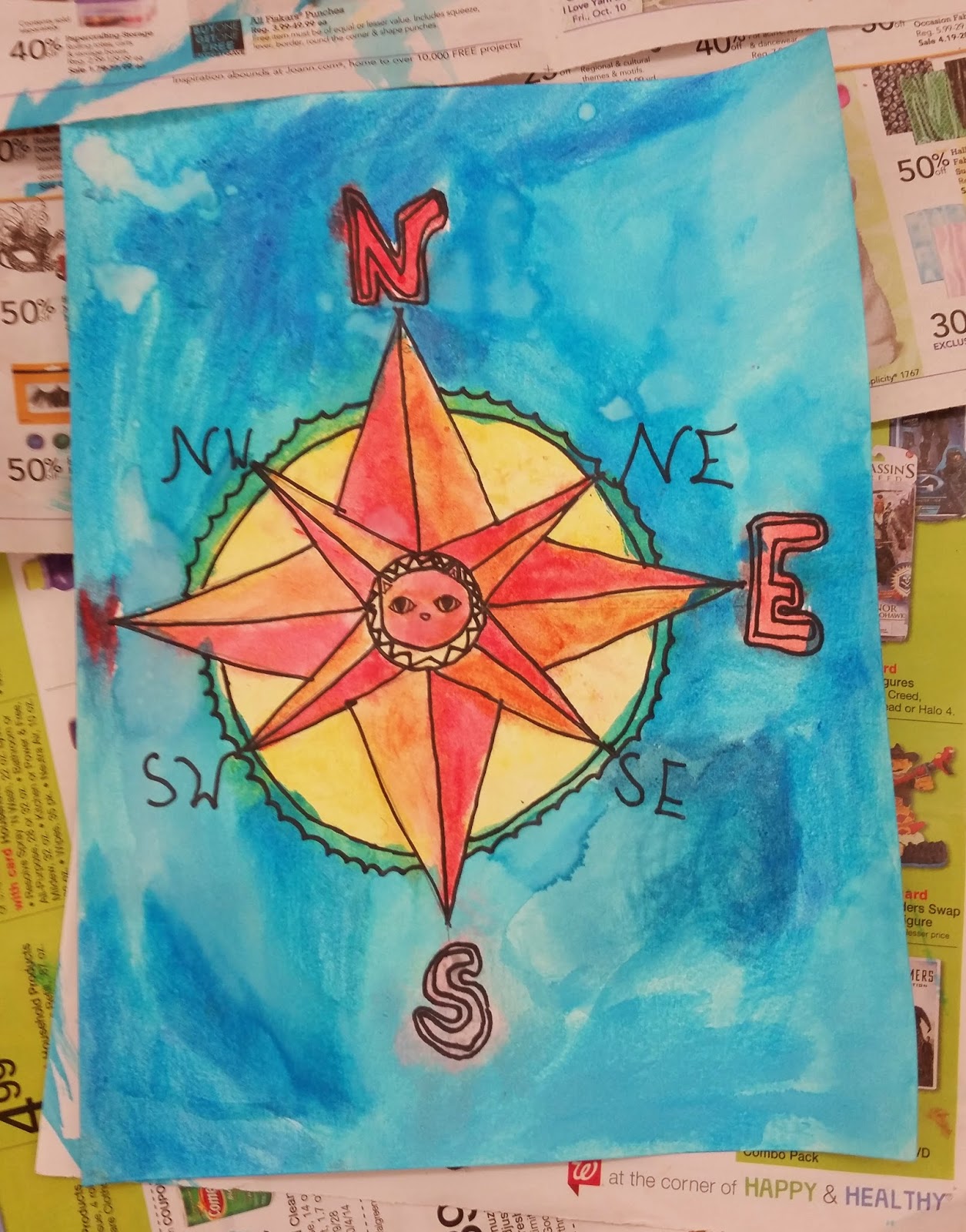
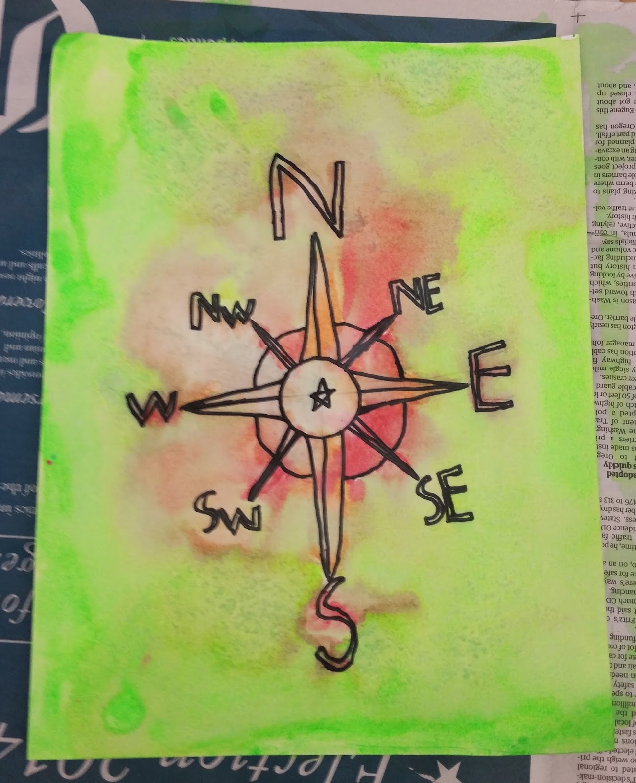
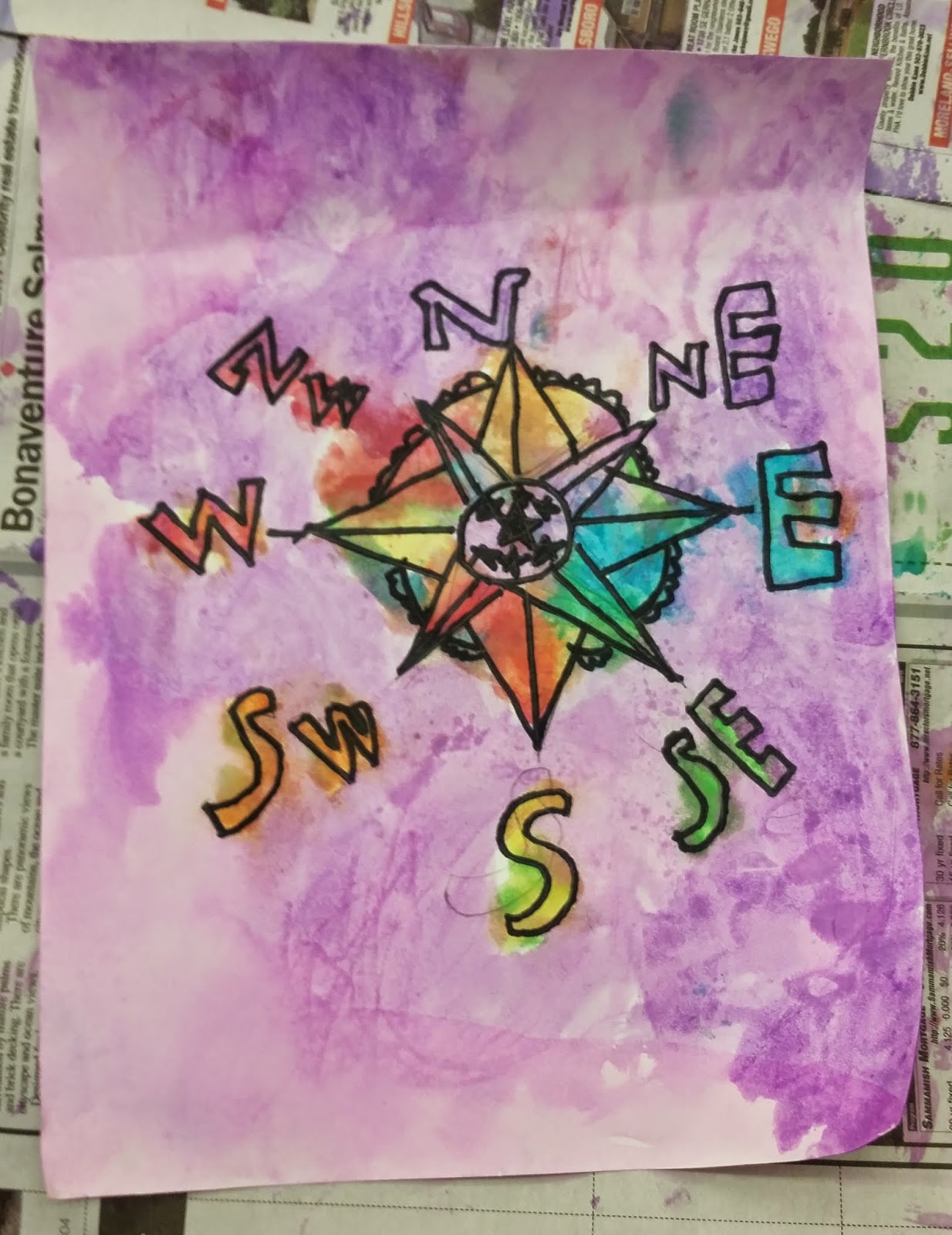
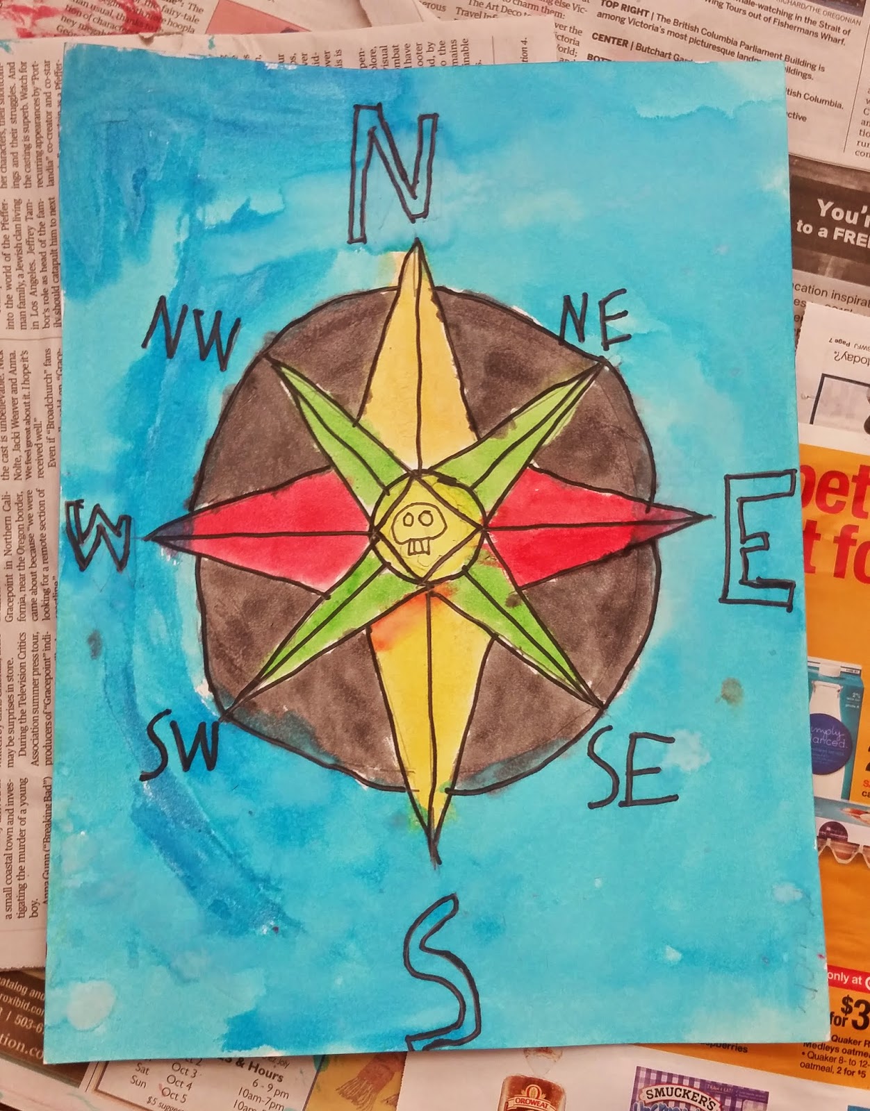
Watercolor Compass
This week’s art project was a combination of geography, math, and art. Our subject matter was the compass rose and our medium was pencil, watercolor, and sharpie.
The students and I began by completing a guided drawing of a compass with precise measurements which required the use of a ruler. Students did a great job with their drawings of the compass!

We then used a sharpie to outline our drawing before adding watercolor paint.


I discussed the use of contrasting color schemes in their pictures so the compass and the background wouldn’t blend into one another. We discussed warm and cool colors and I demonstrated the use of a cool colored background with warm colors on the compass. I encouraged them to choose contrasting warm and cool colors in their own paintings.


Most students finished, but some students will be finishing their's up this week. They did a fantastic job! Check out the pics of some of our finished compass roses!


.jpg)


ART Lesson #8
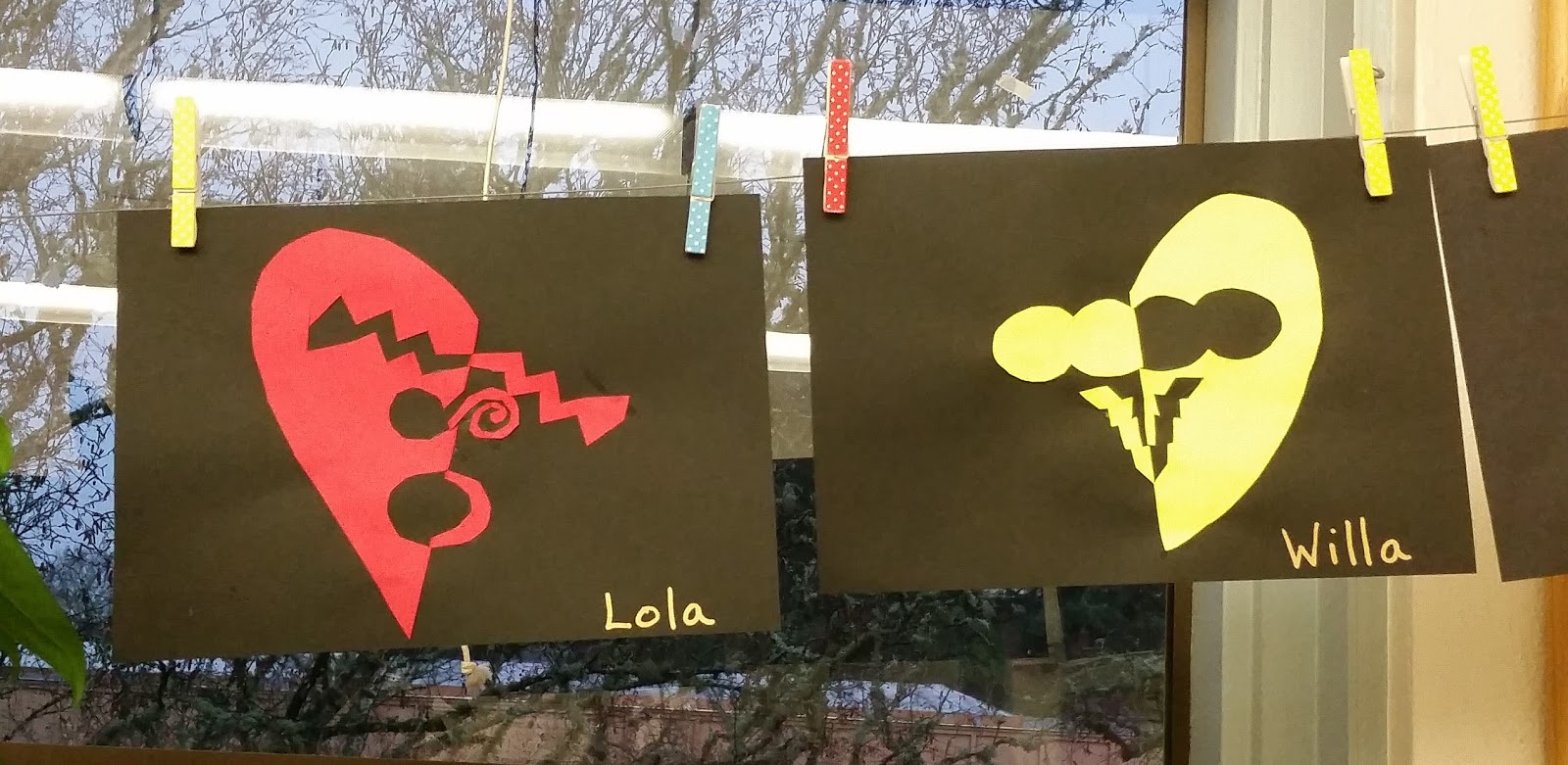
This week the students had several creative sessions in the classroom. We took a moment on Monday to put up some visual art in spirit of Valentines Day. I introduced the students to a Japanese Design technique called Notan.

Notan involves the placement of light and dark next to each other, and the interplay of both positive and negative space. Some students struggled slightly with the task, but most of the work turned out great!
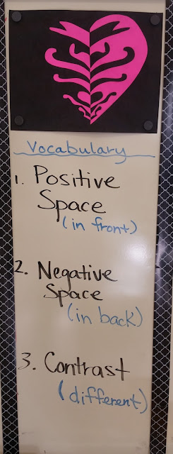


Each student chose a different high contrast color to go on their black background.

Students began with half of a heart and then designed shapes that would be cut out and reflected the other direction.

The resulting image has reversed positive and negative spaces.

Each student chose a different high contrast color to go on their black background.


ART Lesson #9
Downtown Portland Skyline


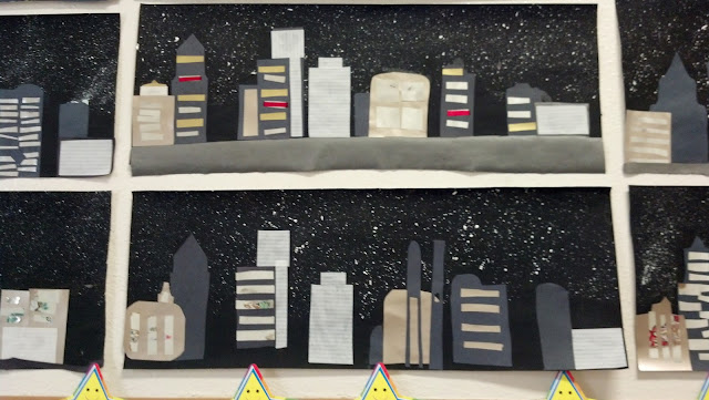
mixed media collage

To help support the students in their attempts to mimic some of Portland's actual sky-rises, I provided each with an image of the downtown Portland Skyline and a handout with the architectural progression of buildings in Portland.

Using these two resources, and materials I prepared for them, they are to create a variety of buildings they can place into their starry nighttime skylines.


ART

We finished our Portland Skyline art just in time to bring them home. This project was slightly challenging for some, but the overall results were successful.


Some of the landmark buildings you should see in the skyline are Big Pink, Coin Tower, and The Wells Fargo Bank Tower. See if you can spot any of them!


ART Lesson #10
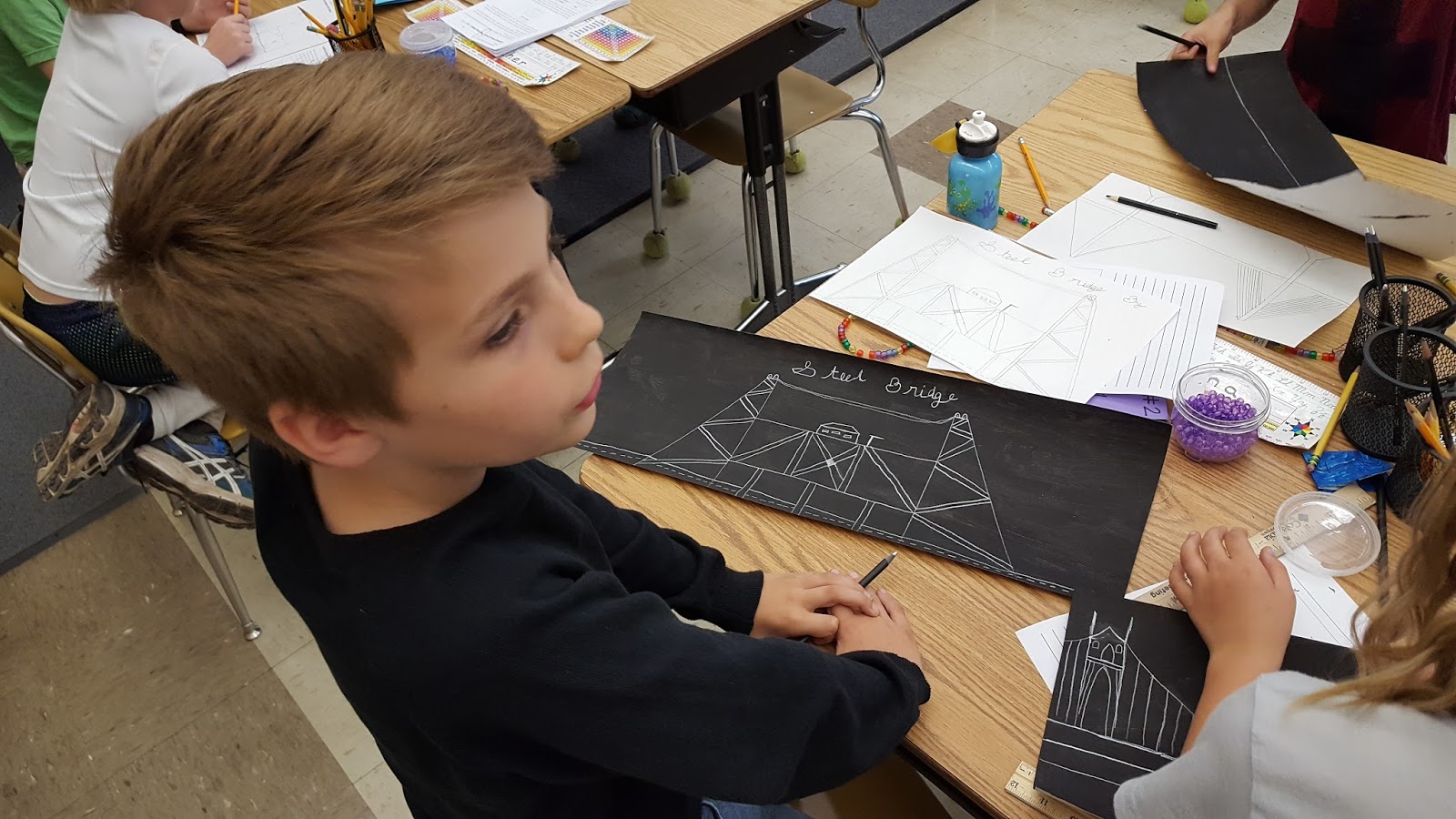
Portland Bridge Drawings
In addition to our Portland Skyline Art piece, we also completed a Portland Bridge Silver Pencil Drawing, on a black tempra background.


The students did a great job!
ART
On Friday, each student chose one of Portland’s Bridges to be the subject matter of their silver pencil drawing.

We used half of the black tempra background we painted last week, to complete a simple line drawing of a Portland Bridge of our choice.

Before drawing, students were asked to look carefully at an image of the bridge and draw a practice sketch before doing their final drawing in silver pencil.


Skyler practiced tracing the Fremont Bridge to get a feel for it's design.

Mason's attention to detail...

Katie and Claire got co-inspired by the Steel Bridge...


Teyah and Owen attending to precision...
When they were finished with their silver pencil drawings they were asked to write the title of the bridge in cursive writing. Most students practiced their cursive titles on paper first before committing them to silver pencil.


Addy used her cursive writing book as a reference before writing her title in cursive.

Wyatt, concentrating on his cursive name...
The students did a great job!


ART Lesson #11
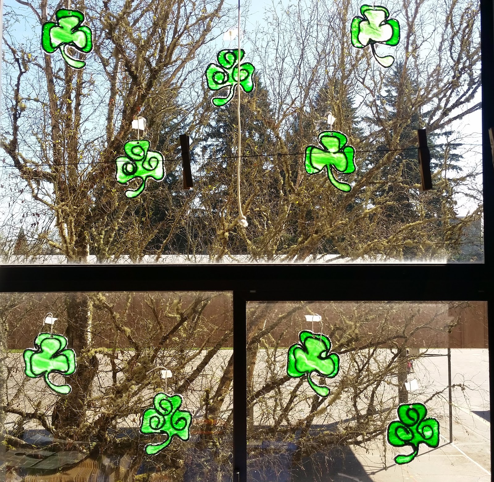
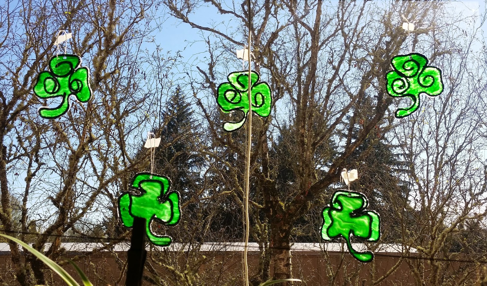
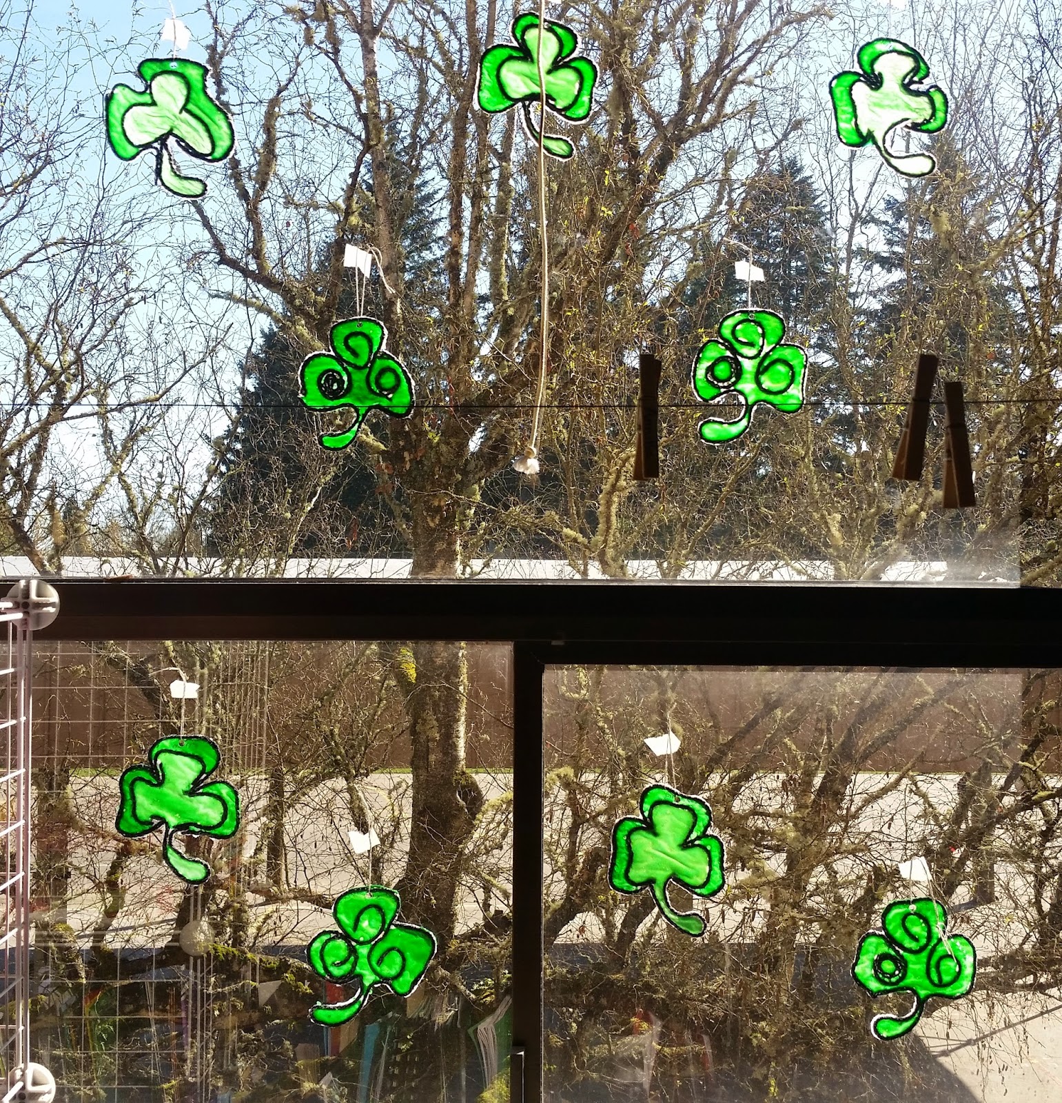
Stained Glue Shamrocks

With St. Patrick’s Day on the horizon I thought we’d create another set of stained-glue window decorations to brighten up the classroom. Students each created two separate stained-glue shamrocks.
DAY 1
We dipped the black yarn in the Elmers glue and traced the outline of the shamrock on top of wax paper.

DAY 2
We poured Elmers Glue stained with green watercolor paint into our shamrock designs.

DAY 3
Peel them off the wax paper and trim the excess glue.
 They turned out fantastic! I will post more pics once they are hung in our windows.

Our stained-glue shamrocks made it up into our windows on Monday just in time for St. Patrick's Day!
ART Lesson #12
Stained Glue Snowflakes

By now, you have probably seen our Stained Glue Snowflakes! The students did a fantastic job on them, and I selfishly wished they wouldn't take them home. They made beautiful window decorations in the classroom. Nonetheless, students were excited to wrap them up and give them to a loved one. Check out the pics of our stained glue snowflake-making process.

 We let these dry for 24 hours.
The next day we poured glue, stained blue from liquid watercolor paint, into the shape of the snowflake.


We left these to dry for 48 hours.


Once they were dry, they were ready to remove from the wax paper. We threaded each with a silver thread and hung them up in the window.


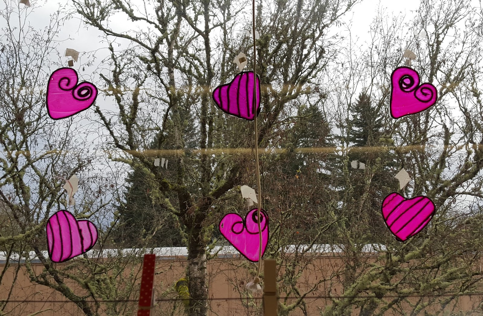
ART Lesson #13
Stained Glue Hearts
We also completed the first step to making stained-glue hearts which we finished up on Tuesday.


We then let these dry for 2 days.


On Friday, we peeled off our stained-glue hearts and hung them up as decorations for our valentine's party.


ART Lesson #14
Op Art Hearts
On Wednesday we completed an op-art drawing lesson that gives the optical illusion of a bulging heart.


On Thursday we glued our op-art heart drawings onto our valentine's bags.

Clay Weaving
This lesson, like the one before, was inspired by Faith Ringold, our artist focus for this year.
Students completed a clay-weaving which related to Faith's use of cloth and textiles in her art.
They each received a slab of clay which needed to be rolled out.
They each received a slab of clay which needed to be rolled out.

Then cut into 6 equal strips.


Next, students added various textures to each strip.


Finally, they wove their strips together to make a solid clay piece.


ART Lesson #16
Winter Wonderland Scenes
Acrylic and Spray Paint on Wood


Before removing the decorations that we spray painted, our art projects looked like this! We almost didn't want to remove the shapes and painter's tape because they looked great at this stage of the process as well!


ART Lesson #17
Portfolio Books
We finished making our books and are ready to glue in our work from this year.

Our smaller book designs.

Our larger book designs.
The students did a great job choosing their style of book. Thank you so much for donating the great designs! This book will be a nice keepsake.
ART Lesson #18
Booklover's Art
During our last week of 3rd grade we spent time doing art each day!
On Monday, I introduced the students to a whimsical art project which involved making small paintings on the pages of a book. We'll just call this series...booklover's art.
Our first painting of the booklover's series was a watercolor flower with a tempra paint border, like the one below.

On Tuesday, we completed a second painting in the series, of an owl in a tree, resembling the one below.

On Wednesday, the students were allowed to go in any direction they wanted, and were given the freedom to play around and experiment. Some suggestions were as follows...
Choose words or phrases on the page to highlight, while painting an image that relates to the words.

Since we were using the pages from my Harry Potter Book that was falling apart, I suggested that one option could be to draw and paint a character from the story.

(sample character, not from Harry Potter)
Finally, I encouraged students to continue with the tree and flower themes which allow them to play around with the positive and negative space on the page, using the words for visual texture on the tree or in the background.


Be sure to look through your child's art portfolio that came home, to see what their unique booklover's painting turned out to be!
This art project has so much potential. I strongly encourage you and your child to take one of your old books from home, and create more booklover's art this summer. This whimsical art form has endless possibilities.
Collaborative Art Project
